Table of Contents
I was recently working on a landing page at Asana that was designed by Devin Jacoviello, one of our talented communication designers at Asana. The page was beautiful and seemed to be a relatively straight-forward project. As we discussed developing the page during our design hand-off, there was one area that did not seem straight-forward in its implementation.
The area that confused me was the component that we call the "masthead." This component lives at the top of the page and contains our page title, subtitle, and a CTA. Additionally, the masthead component for this specific landing page has floating elements that surround the content and provide some visual elegance.
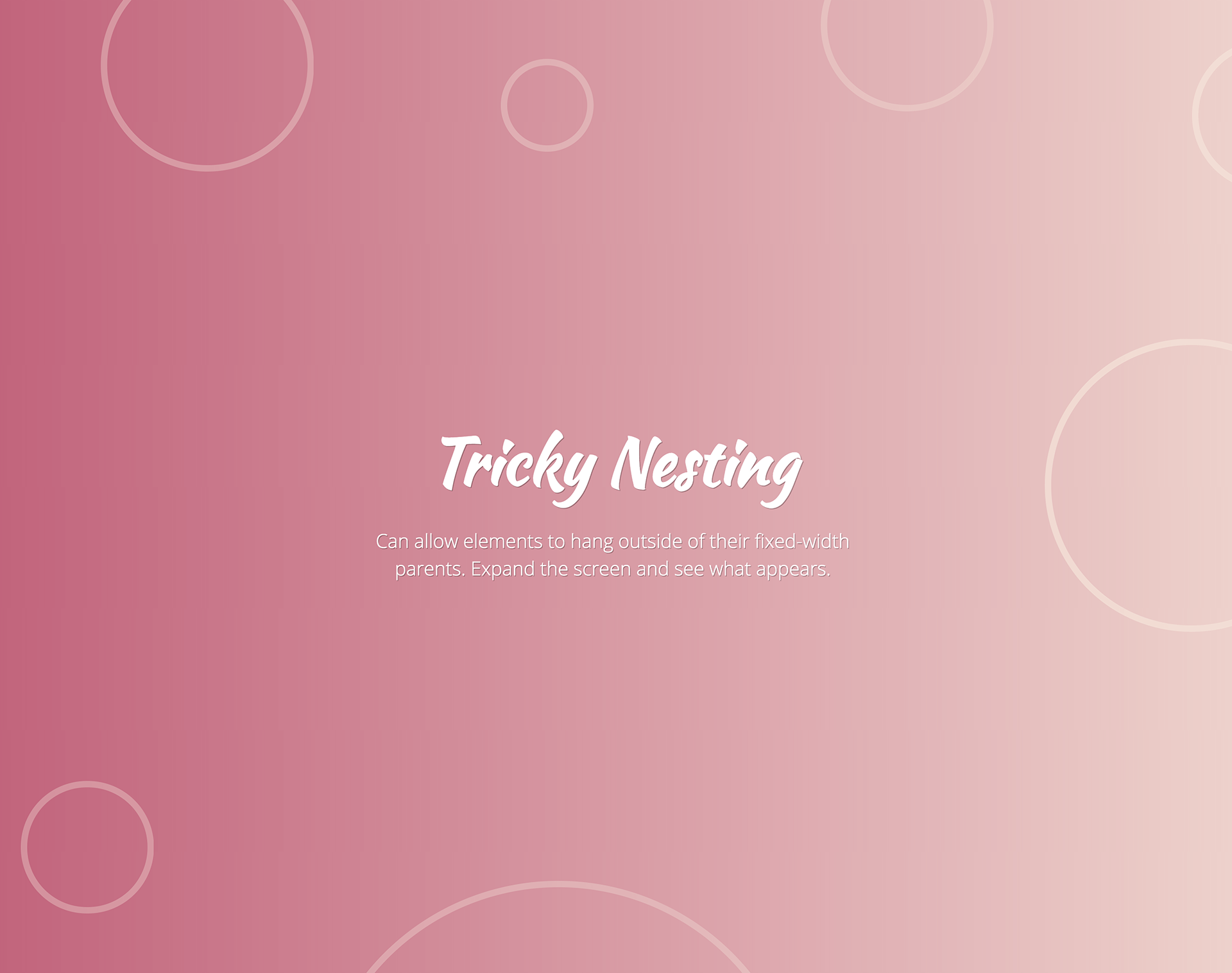
Because this landing page is not live, let's say the design looks something like this:

As Devin and I walked through the implementation details, he described the interaction for the masthead component. He explained that at sub-1920 pixel viewports the floating elements would be positioned off-screen surrounding the content. If the screen grew larger, the elements would remain at their location, but more of the element would be visible to the user.
When described to me, this seemed like a pretty straight-forward interaction. I had never built something like this before, but I wouldn't imagine it being very hard to accomplish.
If that were the case, I wouldn't be writing this blog post.
Approaches
Solution 1
During my first pass at implementing the design, I built a layout with a fixed-width container that contains many child elements that are absolutely positioned to achieve the desired effect.
This solution achieves the desired effect, with one caveat: we have horizontal overflow because of our off-screen content.
Solution 2
Naturally, if we want to remove the horizontal overflow for our off-screen content, we can apply overflow-x: hidden; to our container and see if that solves our problem.
This solution works well on sub-1920 pixel viewports, but when you have a larger viewport, we get the following issue:

Because we're removing all horizontal overflow from our container, when you have a viewport larger than 1920 pixels, the remaining parts of our floating elements are cut off.
Solution 3
We need a solution that allows our floating elements to be positioned off-screen on sub-1920 pixel viewports without any horizontal overflow, and on viewports larger than 1920 pixels the entire floating elements are visible.
To achieve this, we are going to add an additional container to our layout.
Note: Reduce the zoom of your browser window if you have a monitor smaller than 1920 pixels and wish to see the effect.
Now, when our user visits this page on a 1920 pixel monitor, they will see all of the floating content, similar to the image at the beginning of this post.
Why does this work? It's because we shift the logic to ensure that horizontal overflow is not visible. We place overflow-x: hidden; on our outer-most container, and in our inner container, we nest all of our absolutely positioned floating elements. Because we are not hiding the overflow in our inner container, the elements that are nested inside of it will display on larger viewports but will not overflow on smaller viewports thanks to our outer container. It's a pretty simple trick and only requires one extra element to work properly.
Shouts Out
Quick shout out to Chris Silich that wrote a blog post about this a few years ago, but no longer seems to be published. This post was one of the only resources I found documenting this solution, and I thought it would be valuable to write about it again since his original post contains broken images and no working examples.